Charts
Charts
Maxim Money can currently create Account Balance, Transaction, Category, Payee and Price charts.
Whenever you create an account, the default chart for that account is set to a Balance History chart.
Account Balance/Value
Account Balance charts show you the balance of an account over time. A filter must be provided, to specify which transactions should be displayed on the chart. You would typically select a date range, and account(s).
The data can be displayed using 3 different chart types.
Value Plot
This will display the account balance over time for each account selected in the filter, as a line.
Stacked Area
This will show the account balance over time for each account. However, the values are stacked on top of each other, allowing you to see your total value over time across the selected accounts.
Area
This is similar to the value plot - each account will be displayed individually from zero, but the area under the line is filled in. Each account will overlap each other.
Transactions
Transaction charts show you a simple sum of your transactions. If the chart type is set to Bar, you can group this by various attributes.
Category
Category charts show you your transactions grouped by category. A filter must be provided, to specify which transactions should be displayed on the chart. You would typically select a date range. Additional filters can be added to refine the data (such as restricting transaction types to just Payments and/or Deposits)
The category level must be specified. At the top level this is simply Income or Expense. If you select Primary Category, this will break the transactions down by the first level of category after Income / Expense, e.g. Employment. If you select Secondary Category, it will break the transactions down by the second level of category, e.g. it might display Salary and Bonuses separately instead of Employment. If a category does not have a secondary level, the parent category will be used. If you select Selected Category, the actual category used on the transaction will be used. This may span multiple levels, e.g. you could have Employment as well as Bonuses.
The data can be displayed using 2 different chart types:
Pie
This will show the percentage of each category your transactions are assigned to, from largest to smallest.
Bar
This will show the sum of each category your transactions are assigned to, broken down by the level of category you select.
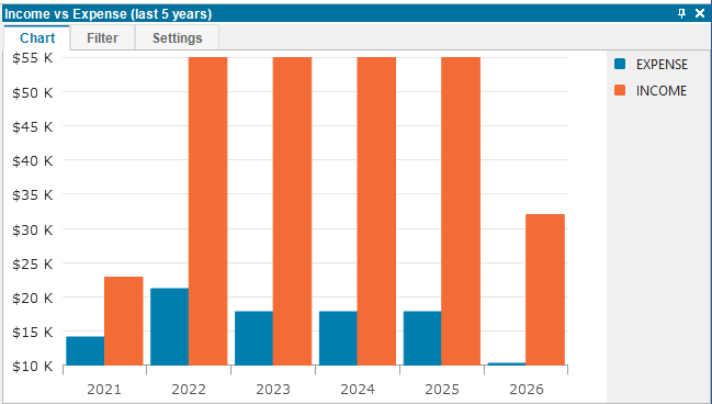
You can also group the above by other criteria, e.g. by year or account, so you can easily create Income vs Expense charts, like so:
Payee
Payee charts show you your transactions grouped by payee. A filter must be provided, to specify which transactions should be displayed on the chart. You would typically select a date range. Additional filters can be added to refine the data (such as restricting transaction types to just Payments and/or Deposits)
The data can be displayed using 4 different chart types:
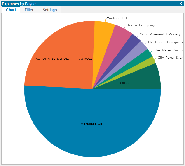
Pie
This will show the percentage of each payee your transactions are assigned to, from largest to smallest.
Bar
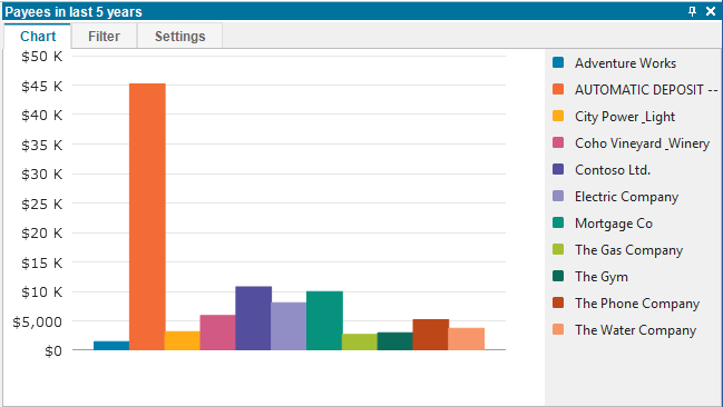
This will show the sum of each payee your transactions are assigned to. You can group these by various categories, such as by year or account:
Price/Rate
Price/Rate charts allow you to plot asset prices over time. This is the default chart type displayed if you select the Show Chart toolbar button when viewing a portfolio holding account. Price/Rate charts can filter on date, identifier, currency or portfolio (to filter on the latter two, switch to Advanced filters). Typically you would filter them on a single identifier or portfolio.
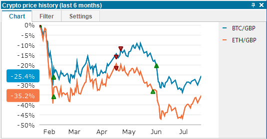
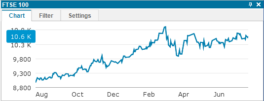
So for example, you can track an index and display the value from the last 6 months:
If you select an asset you have traded on, the Buy and Sell points will automatically be added to the chart: